Broaster Buzz

The History of the Genuine Broaster Chicken Logo
Few things in life can say so much with so little – but that’s exactly what logos do. Buried somewhere deep in the subconscious, our brains pick up subtle, little details which create a connection between a certain set of graphic marks/symbols and a particular brand.
And, the best logos have meaning. They’re like mirrors that reflect the products/services, values, and legacies of the brands they represent. In short, logos are pretty dang cool.
So cool, in fact, that we felt it was time to share a behind-the-scenes look at how the Genuine Broaster Chicken logo has reflected our company over the years…and will continue to do so with an eye to the future.
“Brands are important. When they’re strong, you can see them a mile away.” – Greg West, Broaster VP of Marketing & Food Innovation
Genuine Broaster Chicken Logo: The Origin Story
Take a stroll with us (if you will) back to the late 1950s. Eisenhower was president, I Love Lucy was still on the air, and Genuine Broaster Chicken had its first logo designed and produced.
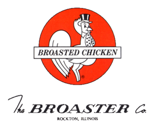
With restaurants and supper clubs being the first food service channel, the initial GBC logo (as pictured above) was created to help us communicate that Broaster consistently offers great-tasting, high-quality chicken (at the time, we only offered our 8-piece Bone-In Chicken as GBC) to our operators and their customers.

The color scheme consisted of white, black, and a reddish-orange color to speak to our fresh, fun, and playful young company. As you can see, the chicken character is wearing a top hat…which is no accident either.
Back in the day, hats were commonly worn in public, and top hats were worn on especially classy occasions.
By including the top hat directly atop the chicken character’s head, the logo began positioning Broaster as a finer form of chicken…a superior chicken product and not just some average chicken operation.
Logo Changes Through the Years
Over the next few decades, as our company grew, it became more and more important that our logo and branding materials respect the past, yet become more contemporary and forward-looking.
As you can see, a variety of new business arms also came about with Broaster Foods, Broaster To-Go, etc., each with their own signage, packaging, and logo usage needs.
Eventually, a shift was made from showing the whole chicken character (who remains nameless, by the way) to creating a clear, recognizable icon with our chicken character in a top hat at the center of it all.
Again, this indicates superior quality that you can trust…even on the go.
As our company matured, we also transitioned to a red, white, and blue color scheme to play up our origins and future as a Midwest company.
“Even if I didn’t know that it was Broaster, the updated color scheme really looks and feels Midwest. It was a great update to bring us closer to the iconic logo we’re now using.” – Greg West, Broaster VP of Marketing & Food Innovation.
Current Logo: Where Do We Go from Here?
And, that brings us to the current Genuine Broaster Chicken logo – a more modern, contemporary adaptation of the logos that came before it.
This truly iconic design is fresh, clean, clear, and downright neighborly, paying great homage to the past, but also looking boldly toward the future.
 “What I really like about the current GBC logo is that it’s been carefully and intentionally designed as an icon, which helps us extend the equity of its meaning to our other food programs. It says that you can expect restaurant-quality…now at c-stores, grocery delis, sports venues, and more.” – Greg West, Broaster VP of Marketing & Food Innovation
The top hat was taken off the chicken’s head and placed into a waving motion. Why, you ask? Well, it helps our brand stay relevant and approachable in a marketplace that features a growing number of younger operators today and may even prepare us for a day when the hat is no longer needed to symbolize quality…who knows?
One thing is for sure, though, and that’s that there is only one Genuine Broaster Chicken and as soon as you see our iconic logo…you know it!


